


Downtown Brampton is currently experiencing an exciting surge of development. Several transformative projects are underway, including a new Centre for Innovation, substantial street infrastructure enhancements, and the vibrant revitalization of key public spaces like Ken Whillans and Garden Squares. Capitalizing on this incredible momentum, the Downtown Brampton BIA proactively recognized the opportunity to significantly elevate its communication and visibility strategy. The clear objective was to firmly establish the organization as a proactive and reliable advocate, consistently championing the interests of local businesses and community partners.
In the fall of 2025, the BIA partnered with Design Holmen and Bespoke Cultural Collective to execute a comprehensive brand refresh and develop a new strategy for organizational positioning, branding, and communications.
The design process began with a thorough discovery phase. The research strongly indicated a clear path forward: the BIA needed to boost community pride, successfully engage with a dynamic younger demographic, and fully modernize its existing brand identity to powerfully reflect the current energy, dynamism, and inspiring progress happening in Brampton.
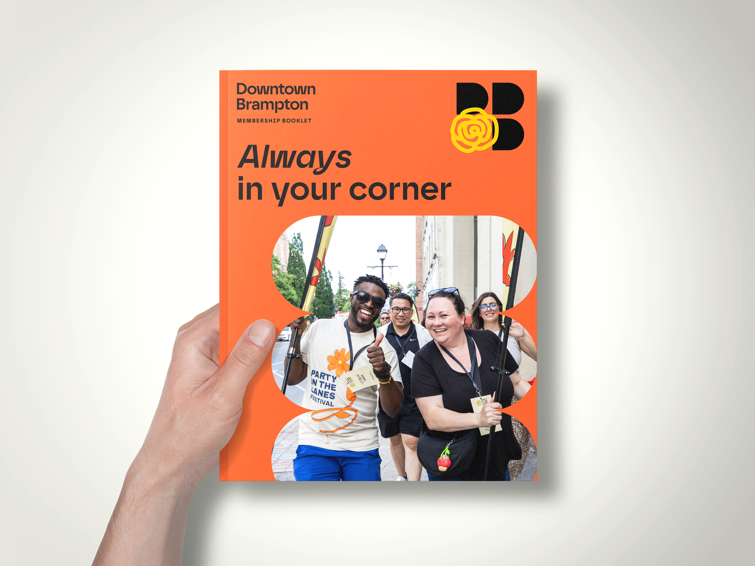
In this phase we designed messaging that created a three pronged approach to the BIA’s many communication needs. The idea was to be as targeted in our communications as possible. “Always in your corner” became the one-liner that positioned the BIA as a community champion and dependable civic ally for local businesses and partners. For the BIAs many programs “feel the beat” was the line to accompany all events and programs. Finally, for all future planning and communications around construction and progress: “the next downtown”. This messaging system allowed for powerful and specific messaging across the brand and its many needs.
With this messaging hierarchy in place we turned our attention to the brand visuals. The idea of “always being in someone’s corner” became a powerful guiding principle in our explorations. A design concept was proposed that established a dedicated creative corner within the letterforms DB, functioning as a landing strip for a diverse library of icons and visuals. This collection encompassed civic elements, such as the rose (representing Brampton, also known as "Flower City"), an iconic clock tower, and the central "Four Corners" intersection, alongside evocative elements communicating creativity, affection, and vitality—all integral aspects of Brampton's dynamic downtown.
The system also seamlessly integrated with the secondary messaging: feel the beat. The BIA already possessed an array of icons and branding assets for its various programs. These assets were incorporated into the corner of the DB logo. This structure ensured the BIA logo supported the programs and communications organically, preventing any perception of it being an afterthought.
The overarching objective was for this brand to remain adaptive, always growing and encouraging community engagement by visualizing their own personal space in their own corner of the world.
A detailed brand guide was also created so that the team would have a framework to reference for consistency and inspiration. The brand guide also featured a colour palette that can only be described as a bright box of crayons! The brand had gone from black and red to a palette in full bloom.
The BIA team was a super enthusiastic partner in this project and always kept an incredibly positive attitude. They were a joy to collaborate with!
Collaborators: Downtown Brampton team: Louroz Mercader, Gabe Abass, Ashley Morrisey, Mooskaan Gupta, Juliana Rivas, Gurleen Bassi, Daniel Simpson, Ryan Gaw
Christina Bagatavicius, Bespoke (Strategy), Steven Tachauer (Design) Adam Damiani (Animation)