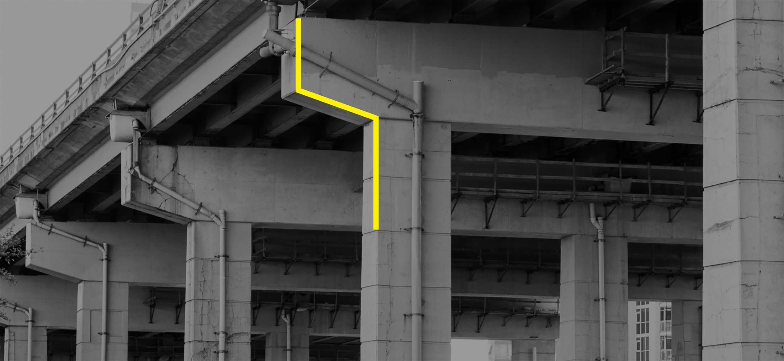


Take an under-utilized dead zone in the city with a much hated highway on top and turn it in to a vital public space that belongs to every Torontonian. This conceptual flip was at the core of our brand identity project for The Bentway. Teach people that massive and imposing cathedral sized concrete pillars can be filled with delight, possibility and personality. These monoliths even have a name: The Bents.
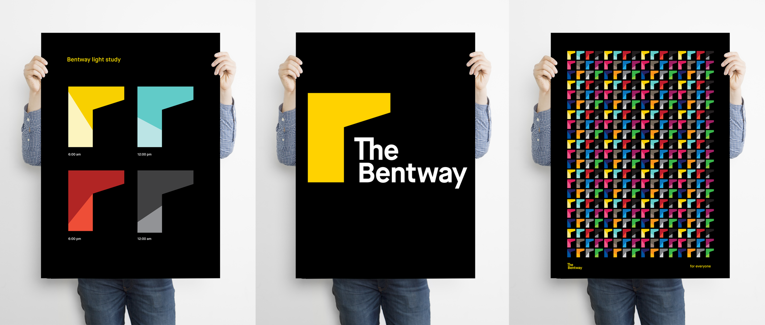
For the identity we retained the iconic yellow from Project: Under Gardiner, the original awareness campaign that Design Holmen and project partner Bespoke worked on. Then we zoomed in on the top of the Bent to create a recognizable icon accompanied by a simple word mark. It received unanimous approval from the many stakeholders involved in the project. Assets were developed to meet programming challenges by taking the form of a frame or a canvas to showcase various images and illustrations. It was an ultra-flexible and scalable system that supported multiple partners and programming.
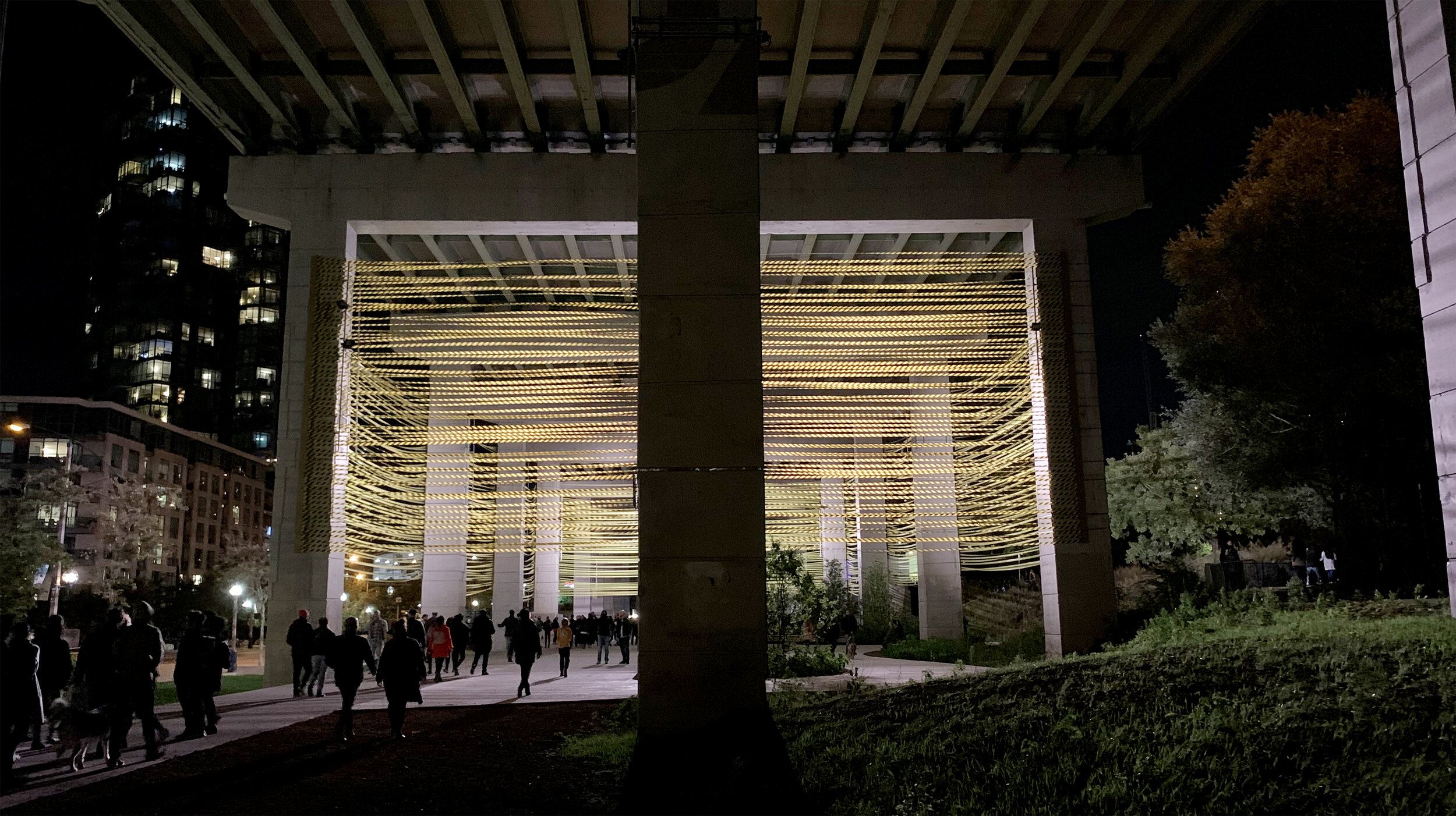
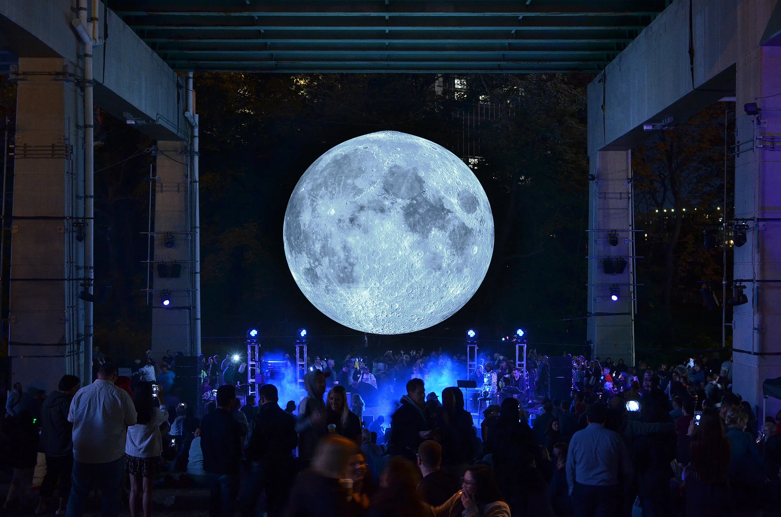
Today the 1.75 km stretch from Strachan to Bathurst is filled with skating, art programming and beautiful landscaping by landscape architects Public Work.
Project Collaborators:
Bespoke Cultural Collective, Tristan Marantos, Public Work, Ken Greenberg, Judy and Wil Matthews, Waterfront Toronto, City of Toronto, Kriss Communication, Good Digital Culture, Harry Choi (photography), Nicola Betts (Museum of the Moon photograph)